Joyce collaborates with visual artist James Jean for gender-free collection

Joyce has launched its Fall/Winter collection in collaboration with visual artist James Jean, with a focus on gender-free fashion.

The collection focuses on fashion individuality and shies away from conventional dress codes for men and women.

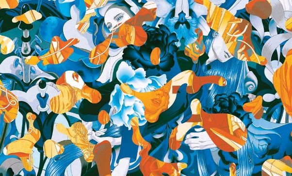
The partnership resulted in three iconic pieces of artwork that depict beauty that is free from gender constraints.

Jean, who has previously collaborated with Prada, is happy to escape the clutches of conformity.

“I’m very pleased to be able to explore the theme of gender fluidity with Joyce,” says Jean. “In my own life, I’ve frequently been identified as both genders, while never fulfilling the expectations of being a dis-gendered male.”

The idea of gender-free fashion is gaining popularity as more and more people become indifferent to gender-specific dressing.

The three pieces Jean created for Joyce are Pistil and Stamen, Facets and Interstices 1.1.

To celebrate the partnership, Joyce will host an exhibition in Hong Kong next month.

4,218 thoughts on “Joyce collaborates with visual artist James Jean for gender-free collection

  1. Hello! Do you know if they make any plugins to assist with SEO?
    I’m trying to get my website to rank for some targeted keywords but
    I’m not seeing very good success. If you know of any please share.
    Thank you! I saw similar art here: Eco product

  2. I’m really inspired together with your writing talents as smartly as with the structure to your blog. Is this a paid theme or did you modify it your self? Anyway stay up the excellent high quality writing, it is uncommon to peer a nice weblog like this one nowadays. I like gafencushop.com ! I made: Madgicx

  3. I am extremely inspired together with your writing abilities and also with the structure for your weblog. Is that this a paid subject or did you modify it yourself? Either way stay up the excellent quality writing, it’s uncommon to see a nice weblog like this one today. I like gafencushop.com ! My is: LinkedIN Scraping

  4. Медицинский портал https://med-portal-24.ru актуальная информация о здоровье, заболеваниях и методах лечения. Симптомы, диагностика, профилактика и советы специалистов для поддержания здоровья.

  5. Мир Labubu https://labubu-world.ru коллекционные фигурки, персонажи и новинки популярной серии. Узнайте о героях, редких выпусках и особенностях коллекции. Погружайтесь в атмосферу Labubu и следите за обновлениями.

  6. Доска объявлений https://oren-i.ru удобный сервис для размещения и поиска объявлений. Продажа, покупка, услуги и работа. Быстро публикуйте объявления и находите нужные предложения в вашем городе.

  7. Инженерные изыскания https://sever-geo.com для строительства в Твери — геология, геодезия и экология участка. Комплексные исследования для проектирования и строительства. Точные данные, соблюдение норм и оперативные сроки выполнения.

  8. Разработка сайтов https://domenanet.online на Laravel — современные веб-проекты с высокой скоростью и безопасностью. Индивидуальные решения, интеграции и масштабируемая архитектура для бизнеса любого уровня.

  9. Солянка Парк https://tzstroy.su жилой комплекс с современными квартирами и удобной инфраструктурой. Отличный выбор для жизни с комфортом и доступом ко всем необходимым объектам.

  10. Online football match statistics soccer stand live scores, events, and live broadcasts. Follow games in real time, analyze teams, and never miss a beat.

  11. Актуальні новини https://lentalife.com поради та історії з усього світу. Дізнавайтеся про події, тренди й корисні лайфхаки, щоб залишатися в курсі та робити життя простішим і зручнішим щодня.

  12. Авто портал https://tvregion.com.ua новости, обзоры и тест-драйвы автомобилей. Актуальная информация о новых моделях, технологиях и рынке. Узнавайте все о машинах и выбирайте авто с удобным сервисом.

  13. Авто портал https://autoguide.kyiv.ua свежие новости, обзоры и тест-драйвы. Рейтинги автомобилей, советы по выбору и актуальные предложения. Все о мире авто в одном месте.

  14. Авто журнал https://psncodegeneratormiu.org новости, обзоры и тест-драйвы автомобилей. Узнавайте о новых моделях, технологиях и рынке. Полезные советы, рейтинги и аналитика для автолюбителей.

  15. Авто журнал https://nmiu.org.ua свежие автомобильные новости, тесты и обзоры. Рейтинги, сравнения и рекомендации по выбору авто. Все о мире автомобилей в одном месте.

  16. Авто портал https://retell.info обзоры автомобилей, тест-драйвы и новости рынка. Сравнения моделей, рейтинги и советы по выбору авто для любых задач.

  17. Женский портал https://lubimoy.com.ua статьи о красоте, здоровье, отношениях и саморазвитии. Полезные советы, лайфхаки и актуальные темы для женщин. Все для вдохновения и гармонии каждый день.

  18. Мужской портал https://swiss-watches.com.ua о стиле жизни, здоровье, финансах и саморазвитии. Полезные статьи, советы экспертов, идеи для карьеры и отдыха. Всё, что важно современному мужчине для уверенности, успеха и баланса в жизни.

  19. Туристический портал https://swiss-watches.com.ua для путешественников: направления, маршруты, советы и лайфхаки. Подбор отелей, билетов и экскурсий, идеи для отдыха и полезные рекомендации. Планируйте поездки легко и открывайте новые страны с комфортом.

  20. Онлайн женский портал https://sweaterok.com.ua мода, уход за собой, здоровье и отношения. Актуальные статьи, советы и идеи для вдохновения и улучшения качества жизни.

  21. Все о беременности https://z-b-r.org и родах: полезные статьи, советы врачей и ответы на важные вопросы. Подготовка к родам, развитие малыша по неделям, здоровье мамы и восстановление. Надежная информация для будущих родителей на каждом этапе.

  22. Современный строительный https://sinergibumn.com журнал: идеи, технологии, обзоры и советы экспертов. Помогаем разобраться в материалах, выбрать решения и реализовать проекты любой сложности — от квартиры до загородного дома.

  23. Портал о дизайне https://lbook.com.ua интерьера: идеи, тренды и практические решения для дома и квартиры. Обзоры стилей, подбор мебели и материалов, советы дизайнеров. Помогаем создать уютное, функциональное и современное пространство.

  24. Профессиональный строительный https://newhouse.kyiv.ua журнал с полезной информацией и практическими решениями. Аналитика рынка, обзоры материалов, инструкции и советы. Всё, что нужно для качественного строительства и ремонта.

  25. Строительный портал https://comart.com.ua для тех, кто ценит качество и надежность. Полезные статьи, инструкции, сравнение материалов и услуг. Найдите проверенных специалистов, получите идеи для ремонта и реализуйте проекты любой сложности с максимальной выгодой.

  26. Женский сайт https://biglib.com.ua мода, уход за собой, психология и здоровье. Актуальные темы, лайфхаки и рекомендации для улучшения качества жизни.

  27. Информационный строительный https://stroyportal.kyiv.ua журнал с экспертным контентом. Технологии, материалы, тренды и советы для частных и коммерческих проектов. Читайте, вдохновляйтесь и реализуйте идеи с уверенностью в результате.

  28. Строительный журнал https://ukrainianpages.com.ua с актуальными новостями, трендами и экспертными материалами. Обзоры технологий, советы по ремонту и строительству, идеи для дома и бизнеса. Узнавайте о современных решениях и применяйте лучшие практики в своих проектах.

  29. Женский журнал https://vybir.kiev.ua статьи о моде, красоте, здоровье и отношениях. Актуальные тренды, советы экспертов и вдохновение для современной женщины каждый день.

  30. Все о строительстве https://azst.com.ua и ремонте на одном портале: от выбора материалов до поиска исполнителей. Практические советы, тренды, технологии и реальные кейсы. Экономьте время и деньги, принимая грамотные решения для вашего дома или коммерческого объекта.

  31. Свежие новости https://hansaray.org.ua Украины: политика, экономика, общество и события дня. Оперативная информация, аналитика и мнения экспертов. Будьте в курсе главных новостей страны и мира в удобном формате.

  32. Женский портал https://virginvirtual.net красота, здоровье, психология и стиль жизни. Полезные советы, тренды и рекомендации для женщин в одном месте.

  33. Все о здоровье https://mikstur.com на одном портале: болезни, симптомы, методы лечения и профилактика. Советы врачей, актуальные медицинские статьи и рекомендации. Помогаем лучше понимать организм и заботиться о своем самочувствии.

  34. Женский онлайн журнал https://whoiswho.com.ua стиль, красота и здоровье. Полезные советы, лайфхаки и актуальные темы для женщин. Все о жизни, моде и саморазвитии.

  35. Женский журнал https://womanclub.in.ua мода, уход за собой, психология и отношения. Читайте интересные статьи, находите идеи и улучшайте качество жизни.

  36. Все о строительстве https://skol.if.ua ремонте и отделке на одном сайте. Практические рекомендации, современные технологии, обзоры и каталог услуг. Найдите идеи, рассчитайте бюджет и воплотите проект любой сложности с минимальными рисками и затратами.

  37. Новости Украины https://status.net.ua сегодня: главные события, политика, экономика и общественная жизнь. Оперативные сводки, аналитика и комментарии. Узнавайте важное первыми и следите за развитием ситуации.

  38. Портал о строительстве https://kennan.kiev.ua и ремонте: идеи, технологии, обзоры и советы экспертов. Помогаем выбрать материалы, рассчитать бюджет и найти исполнителей. Удобный сервис для планирования и реализации проектов — от квартиры до загородного дома.

  39. Строительный портал https://solution-ltd.com.ua с актуальной информацией и практическими решениями. Узнайте о новых технологиях, сравните материалы, получите советы и найдите специалистов. Сделайте ремонт или строительство проще, быстрее и выгоднее.

  40. Онлайн журнал https://start.net.ua о строительстве, ремонте и дизайне. Разбор технологий, советы экспертов, обзоры материалов и реальные кейсы. Помогаем принимать грамотные решения и реализовывать проекты любой сложности без лишних затрат.

  41. Строительный журнал https://sota-servis.com.ua о ремонте, отделке и строительстве. Актуальные статьи, кейсы, лайфхаки и рекомендации специалистов. Будьте в курсе новинок и принимайте грамотные решения для своих проектов.

  42. Онлайн сайт для женщин https://elegance.kyiv.ua статьи о красоте, отношениях, семье и саморазвитии. Советы, идеи и вдохновение для повседневной жизни.

  43. Сайт для женщин https://bestwoman.kyiv.ua статьи о красоте, здоровье, отношениях и стиле жизни. Полезные советы, тренды и идеи для вдохновения. Все, что нужно современной женщине, в одном месте.

  44. Строительный журнал https://tozak.org.ua с полезными статьями и актуальными обзорами. Освещаем современные технологии, материалы и тренды в строительстве и ремонте. Практические советы, идеи и решения для создания комфортного и надежного пространства.

  45. Онлайн строительный https://reklama-region.com журнал для профессионалов и частных застройщиков. Полезные статьи, разборы материалов, новинки рынка и практические рекомендации. Все о строительстве, ремонте и дизайне в удобном формате.

  46. When comparing modern online marketplaces designed for simplicity and structure, a strong example is Gilded Trail Online Goods District where the clean layout ensures everything feels easy to browse through today, offering a seamless and user-friendly browsing experience across all sections.

  47. While comparing multiple e-commerce style layouts for usability insights, I encountered a platform that performed better than expected when I reached Coastal Icicle Market – the overall structure felt intuitive, and content appeared almost instantly as I navigated through different sections.

  48. In the middle of browsing through cuisine and dining websites, I came across something that stood out see this food page and it immediately caught my eye, looking flavorful and full of character with a strong culinary appeal overall

  49. Искал интернет магазин, где можно заказать телефон и не переживать за качество. Здесь всё понравилось: от консультации до получения товара. Сотрудники вежливые, отправка быстрая, сам смартфон полностью соответствует заявленному. Отличный вариант для покупки: купить телефон магазин

  50. As I continued going through various animal lover print and art websites, I encountered something within the text see more here and it provides adorable pet-related prints that are highly recommended for animal lovers overall

  51. As I continued exploring different thought driven websites and ideas, I noticed something embedded in the content learn more here and the idea is inspiring, clearly distinguishing itself from other content I’ve come across

  52. During my exploration of positive lifestyle and happiness-themed pages, I came across something within the text view smile site and it carries a cheerful tone, with content that feels light, uplifting, and naturally positive

  53. In the middle of reviewing personal lifestyle blogs and story-based websites, I found something that caught my attention explore lifestyle blog and it feels authentic overall, with content that comes across as very personal and easy to relate to

  54. As I was reviewing different innovation and lab research websites, I found something embedded in the text visit research page and it presents a clean design with an interesting focus, making it feel like a reliable and solid resource

  55. As I continued going through various academic platforms and school pages, I found something mid-content explore more here and it looks professional and welcoming, giving a strong first impression that feels inviting and well organized

  56. As I continued browsing lifestyle and creative web platforms, I found something placed within the text see clocktower page and it has a unique feel that makes exploring its offerings quite interesting and refreshing overall

  57. While browsing food inspiration sites and global cuisine pages, I discovered taste blend link – The cultural mix feels exciting and fresh, and the menu images are so appealing they made me hungry almost immediately without warning.

  58. While exploring comprehensive wellness systems, I came across holistic movement yoga resource designed for full-body balance – it integrates yoga flows, breathing techniques, and mindfulness practices to support strength, flexibility, and emotional well-being through structured and consistent daily routines effectively

  59. While reviewing several digital shopping platform experiments for interface responsiveness and clarity I navigated a catalog view where Lemon Lark Vendor Space – items were grouped in an intuitive manner that allowed me to quickly locate what I needed, making the entire browsing session feel efficient and pleasant.

  60. Консультацию психолога https://психолог38.рф в Иркутске можно получить в центре Психолог38. Здесь работают высококвалифицированные специалисты: детские психологи, клинические, семейные и индивидуальные. Мы собрали профессионалов разных направлений, чтобы комплексно подходить к решению запросов клиентов. Бережно, деликатно, с научным подходом. Сложные ситуации в нашей жизни встречаются не редко, и своевременная помощь, поддержка очень важна. Находясь среди людей, легко можно оказаться в одиночестве, один на один со своими проблемами. Если вы ищите лучших психологов, которые реально помогают людям, обратите внимание на нашу организацию.

  61. While testing different digital retail environments for usability behavior and interface responsiveness comparison, I came across a catalog interface containing Silk Lakefront Commerce Hub inside a structured grid layout, and – the design felt clean and distraction-free, making browsing through pages smooth and visually comfortable without unnecessary complexity.

  62. While going through several baking recipe pages, I found something in the middle of everything else, read more here, and the site is clean, fast loading, and runs smoothly which makes browsing enjoyable overall

  63. As I browsed through several digital document handling tools, I noticed something placed within the content discover this site and it is a useful document solutions platform that feels efficient and well organized overall

  64. Смартфон пришёл именно такой, как я и ожидал. На сайте описание было точным, а менеджер дополнительно ответил на мои вопросы. Заказ обработали быстро, доставили без задержек. Магазин работает честно и профессионально: 77 store интернет магазин официальный сайт каталог

  65. While comparing online shopping platforms focused on usability and design, a notable example is Stone Ember Experience Vault which maintains clean and modern look makes the browsing experience quite pleasant, providing a calm, simple, and intuitive browsing environment across all sections.

  66. During my search for interesting festival-related platforms, I noticed check this event site – The content feels lively and well structured, making it enjoyable to browse while also providing helpful and relevant information in a clear and accessible format.

  67. As I moved through different pages and resources, I found something that appeared naturally between everything else, explore further, and it seems like a valuable effort is being made to highlight an important topic

  68. People who enjoy natural and rustic online shopping platforms often browse sites like Cove Wheat Outpost Market Flow where navigation is smooth and categories are clearly structured – The overall design ensures a comfortable browsing experience that feels simple, inviting, and easy to use from start to finish.

  69. As part of my research into festive online experiences, I came across explore this festival – The information is presented in a fresh and engaging way, making it enjoyable for users to browse while still feeling informative and practical.

  70. People who prefer simple and bright online shops often explore sites like Goods District Sun Cove Market where items are arranged in a structured and user friendly design – The browsing experience feels enjoyable and efficient, with clear categories that help users find what they need quickly.

  71. In comparisons of e-commerce systems focused on clarity and usability, a strong example is Glade Vendor Frost Vault which maintains feels structured and simple, making it easy to explore content, providing a smooth browsing experience through clean and logically arranged sections.

  72. While casually browsing a variety of online resource sites, something appeared in context, see details, and it uses a simple layout that makes it easier to browse and find information quickly

  73. While browsing detailed Hawaiian accommodation listings, I discovered a boutique property page with strong presentation quality online and recently viewed < big island inn profile – The information is clear and inviting, offering a well balanced overview of comfort, scenery, and guest experience overall feel

  74. While looking through independent media style sites I discovered a simple platform that focuses on opinion based writing using independent thought stream – the presentation is minimal and the ideas are expressed in a way that feels direct and sometimes intentionally challenging to interpret deeply

  75. Users who appreciate refined ecommerce aesthetics often respond positively to layouts that prioritize spacing, clarity, and visually guided browsing paths across pages gildedcove refined emporium – The structure creates a seamless shopping flow where each product feels intentionally placed for easy discovery and visual comfort.

  76. Residents interested in cultural performance initiatives often look for platforms that showcase theatre events and workshops, and they might discover theatre outreach network community arts connection hub – This resource emphasizes public engagement and highlights creative programs designed to bring theatre experiences closer to local audiences and participants.

  77. Across various e-commerce experience evaluations focused on usability, a notable example is Gilded Brook Network District where nice visual balance and navigation works without any confusion, helping users interact with a clean and efficient browsing environment across all pages.

  78. While searching for seasonal festival inspiration, I encountered access this page – The content is structured in a clear and engaging way, making the browsing experience smooth and informative for all users.

  79. People who prefer visually refined shopping platforms often engage with sites such as Wave Artisan Trail Hub where products are arranged in a clean and structured format – The interface supports creative presentation and smooth navigation, allowing users to enjoy a balanced and visually engaging shopping environment.

  80. People who enjoy clean digital storefronts often prefer vault-style ecommerce designs that keep everything organized and visually easy to scan at a glance Harbor Glass Vault Display – The interface is minimal and polished, ensuring browsing feels smooth, intuitive, and visually consistent from category to category.

  81. While researching unique digital shopping experiences, I found a conceptual supermarket platform that focuses on simplicity and clarity in design hope based shopping hub – The layout feels straightforward and effective, providing a smooth and easy to follow browsing experience overall presentation

  82. In comparisons of modern shopping platforms focused on user experience, a strong example is Glade Trade Night House which maintains everything feels straightforward and browsing is comfortable and stable, ensuring a calm and easy navigation flow throughout the entire site.

  83. While browsing curated modeling and design showcases I found a platform that emphasizes visual clarity and simplicity using model and art showcase – the presentation feels refined and organized creating a professional impression for visitors exploring the content

  84. Shoppers who appreciate clean layouts and minimal ecommerce structure often notice how intuitive browsing experiences improve satisfaction when they explore platforms such as Berry Cove Outpost Shop where product discovery feels smooth and organized for everyday users, reducing unnecessary complexity while guiding visitors toward relevant items quickly – The storefront focuses on simplicity and clear navigation, making the overall shopping journey feel relaxed and easy to follow

  85. While exploring premium wine labels and vineyard branding sites, I came across a clean and well structured platform showcasing product excellence canadian icewine product page – The brand presentation feels detailed and attractive, making the wine information easy to understand and visually refined overall

  86. While reviewing several informational suggestions online, I noticed something that stood out in context, learn more here, and it provides content that is structured in a way that makes it simple to understand and follow

  87. While analyzing different environmental awareness websites, I noticed use this resource – The layout is clean and structured, making it easy for users to appreciate the effort and care put into presenting the information clearly.

  88. People who prefer simple digital commerce platforms often explore sites like Harbor Teal Organized Commerce Hub where items are displayed in a structured and accessible layout – The interface ensures a fast and easy browsing experience that feels clear, efficient, and user friendly throughout the store.

  89. People browsing ecommerce collections often appreciate structured collective designs that keep everything organized, making product comparison and discovery more efficient Glade Collective Ridge Platform – The layout feels modern and clear, with a simple interface that makes browsing smooth and visually easy to process at every step.

  90. While exploring artistic web development projects, I found a platform that uses experimental structure to deliver a highly creative browsing experience creative digital structure site – The website feels uniquely designed, with content arranged in an experimental and visually engaging format throughout the experience

  91. People who prefer curated handmade collections often find satisfaction in browsing sites such as Brook Artisan Collective where products are organized to highlight natural textures and creative workmanship – The design strongly reflects an artisan identity, making every item feel unique, expressive, and rooted in authentic handmade tradition.

  92. While browsing various creative and entertainment-focused websites online, I came across visit this squad hub – The site feels really cool overall, with a design that stands out and content that keeps things interesting and engaging throughout the browsing experience.

  93. Users who prefer minimal ecommerce systems often explore sites such as Trail Commerce Harbor Market Hub where products are grouped in a clean and accessible format – The design ensures browsing feels smooth, user friendly, and well organized, helping users quickly locate what they need without unnecessary complexity.

  94. Users who appreciate clean online marketplaces often value emporium layouts that improve navigation and make browsing feel more natural and effortless Glass Emporium Coastal Harbor – The presentation is refined and structured, offering a seamless shopping experience where each product is easy to view and understand at a glance.

  95. While exploring modern professional profile pages online, I discovered a clean and well organized portfolio website with smooth usability oconnor digital portfolio showcase – The layout is simple and professional, with clearly presented information and easy navigation that enhances the user experience overall

  96. While analyzing different celebration websites, I noticed use this site – The content is consistently well presented, and the overall experience feels engaging, with a layout that supports easy browsing and clear understanding.

  97. While going through several creative website ideas, I found something that stood out in the middle of everything else, read more here, and the first impression is clearly positive since the layout looks modern, clean, and polished

  98. People who enjoy minimal yet structured ecommerce designs often appreciate emporium layouts that maintain strong visual branding and organized content presentation Stone Glass Showcase Emporium – The interface feels cohesive and refined, allowing users to browse smoothly while maintaining a consistent visual experience across the platform.

  99. While exploring creative portfolios and expressive platforms I discovered a site that emphasizes bold design choices including art driven web hub – the site feels confident and visually rich providing an engaging browsing journey from start to finish

  100. When analyzing structured UX layouts in e-commerce systems, a standout example is Orchard Flow Upland Hub which features well structured pages and browsing feels natural and efficient, ensuring consistent usability and clarity throughout the platform.

  101. While exploring creative cultural websites, I discovered a platform that combines different world influences into a unified and engaging layout jeddah brooklyn fusion site – The experience feels culturally diverse and interesting, offering a smooth and visually engaging presentation of mixed themes overall

  102. Modern ecommerce explorers often prefer gallery styled platforms that emphasize spacious layouts and curated visual flow Golden Galleria Cove Space – The design prioritizes clarity and balance using structured grids and refined spacing to guide user attention naturally allowing shoppers to engage with products comfortably while maintaining a cohesive visual identity that enhances trust and browsing satisfaction across all sections today

  103. Online visitors interested in creative goods frequently prioritize platforms that blend design and usability and while navigating different shops they may encounter harbor violet craft market offering diverse artisan selections and smooth category transitions for improved shopping comfort – This marketplace provides an engaging experience centered on handcrafted quality and intuitive browsing structure.

  104. During my browsing of professional development and business help platforms, I noticed several informative pages and found professional help desk page – The information is clearly presented and practical, helping users quickly understand solutions without unnecessary complexity or confusion.

  105. While browsing unique cultural fusion websites, I discovered a platform that mixes different stylistic and thematic elements in an appealing digital presentation brooklyn jeddah fusion hub – The experience feels engaging and culturally diverse, offering a creative blend of ideas that keeps the content visually interesting

  106. Users who appreciate interactive online trading spaces often explore platforms like Collective Pine Harbor Market where the structure supports shared seller participation and ongoing updates – The browsing experience feels energetic and community oriented, with a design that reflects a living and evolving marketplace environment.

  107. While browsing modern corporate websites I found a platform that focuses on usability and structured design including corporate navigation hub – the overall experience feels streamlined with clear sections that guide users through the content effortlessly

  108. Users exploring cool themed ecommerce platforms often appreciate how refreshing layouts improve browsing comfort when visiting sites such as Icicle Isle Frost Market Hub where products are arranged with icy clean visuals and structured navigation – The cool themed design creates a refreshing browsing experience that feels light, simple, and easy to navigate, making product discovery smooth and visually calming throughout the store.

  109. I came across this quirky volleyball related page while browsing through sports fan content and it immediately stood out for its tone josh inspired sports nook – The site feels creative and casual, delivering a lighthearted approach to sports content that makes it easy and enjoyable to browse

  110. People drawn to cozy and functional ecommerce platforms often explore websites such as Cove Warm Essentials Store where simplicity drives the entire browsing experience – The layout supports quick understanding of product offerings while keeping navigation smooth and user friendly

  111. While looking into property listing platforms I discovered a site that organizes housing information in a way that feels efficient and accessible kaufman property viewer tool – The browsing experience is clean and practical, allowing users to focus on available listings without unnecessary distractions or cluttered design

  112. While looking into modern dating solutions that prioritize ease of use I discovered a site built around casual dating interface – the design feels straightforward and the experience is smooth making it easy for users to explore options without dealing with complicated layouts or confusing menus

  113. People who enjoy nature themed online stores often engage with sites like Outpost Rustic Timber Trail Hub where items are displayed in a wood inspired format – The interface ensures browsing feels smooth, visually warm, and easy to manage across all categories of the shopping site.

  114. While searching for reliable family film directories I came across a platform that carefully curates safe viewing options for children and general audiences alike safe entertainment film hub – The site feels organized and user friendly, making it easy to explore appropriate movies without unnecessary complexity

  115. During a casual browsing session across different informational pages, something caught my attention while reviewing multiple links, have a look, and it seems like a practical website that presents information clearly and keeps navigation simple and user-friendly

  116. In the process of reviewing multiple structured websites, I found explore this rtc site – The organization of content stands out, helping users easily locate important information without feeling overwhelmed or lost in disordered sections.

  117. While exploring branding focused dessert websites I came across a platform that highlights sweet inspired visuals with a strong sense of structure and clarity that makes navigation simple and the content visually appealing for users interested in design aesthetics dessert themed brand studio – The site feels well crafted and visually engaging, with a smooth layout that supports easy browsing

  118. People who prefer straightforward ecommerce experiences often enjoy platforms that emphasize accessibility and product clarity, especially when using Meadow Trade Center where the browsing system is designed to be intuitive and efficient, ensuring users can move through categories without confusion or unnecessary effort.

  119. Shoppers looking for artisanal online destinations frequently explore curated platforms where creativity meets commerce and may come across violet harbor craft exchange showcasing handmade products with refined presentation and accessible browsing tools for everyday users – A thoughtfully designed store that highlights unique crafts while maintaining an easy and enjoyable shopping flow.

  120. While browsing football injury recovery and therapy resources I found a platform that focuses on practical sports rehabilitation concepts and presents them in a supportive and easy to understand format for athletes and coaches player recovery support page – The information feels helpful and well structured, focusing on performance recovery ideas

  121. Users who value simple ecommerce outlet systems often browse sites such as Harbor Pine Discount Mart Hub where products are displayed in clearly defined groups – The layout emphasizes usability and order, making browsing efficient, intuitive, and easy to manage across all sections of the marketplace.

  122. Are you looking for a fast, safe and hassle-free transfer in Valencia? We offer professional transport and moving services, both for individuals and companies. Request your budget without obligation and enjoy a quality service: https://trasladoavalencia.es/

  123. Shoppers drawn to clean ecommerce systems often value vault inspired interfaces that maintain clarity and structured browsing experiences across all pages Vault Harbor Hazel System – The platform ensures intuitive navigation and organized product display helping users move through categories smoothly while maintaining a minimal and visually consistent environment designed to enhance usability and overall browsing satisfaction throughout the experience today.

  124. Shoppers who prefer clean and efficient ecommerce hubs often visit platforms like Bright Sun Harbor Market – The interface ensures intuitive browsing and well organized sections, helping users quickly identify products while maintaining a welcoming and visually balanced shopping experience overall.

  125. While checking out different artist and band pages online, I stumbled upon open this band site – The style is really appealing, and the presentation feels smooth and well structured, making it enjoyable to browse through the content.

  126. While browsing urban lifestyle platforms I came across a Seattle focused site that highlights modern city living with a vibrant tone and visually dynamic presentation making it feel engaging for readers interested in urban culture design and contemporary lifestyle trends urban city living hub – The site feels modern and energetic, showcasing urban lifestyle content in a way that feels fresh and visually engaging

  127. During research into handmade product spaces I discovered a well organized marketplace that supports independent creators effectively where Walnut Cove artisan showcase organized with clean design and easy navigation structure flow system – It highlights creative talent while maintaining a balance between aesthetics and usability across platform experience

  128. While searching e-commerce storefronts I discovered a website that presents products in a neat and structured format allowing users to browse smoothly without unnecessary clutter or confusion clean retail product hub – The layout feels minimal and functional

  129. During a review of online vendor systems, I came across a layout where Birch Harbor curated shop index appears seamlessly integrated into the page body – Vendor hall showcases diverse listings and provides a user friendly browsing journey that emphasizes clarity, speed, and organized presentation of available products across multiple categories.

  130. In the middle of comparing different materials, I saw go to this site – The layout feels intentional and refined, ensuring that every piece of information is easy to locate and comprehend without unnecessary effort.

  131. Users who prefer visually rich ecommerce experiences often engage with platforms such as Harbor Trail Studio Market where vendor products are arranged in a carefully styled format that emphasizes aesthetics and clarity – The design supports a creative shopping journey where each product feels thoughtfully presented and visually aligned with a studio inspired theme.

  132. People who enjoy curated digital vault marketplaces often engage with platforms like Ridge Ivory Collection Vault Market where items are displayed in a structured and premium layout – The design emphasizes cleanliness and organization, ensuring browsing feels smooth, modern, and visually consistent while maintaining a sense of curated exclusivity.

  133. While exploring neighborhood information platforms I came across a Lochwinnoch site that provides local updates in a welcoming tone designed to make community information easy to access and understand for all users lochwinnoch local welcome page – The content feels clear and approachable

  134. Many shoppers appreciate online platforms that combine organized layouts with intuitive navigation, especially when exploring large inventories through systems comparable to Seaside Goods Hub which is designed to support efficient browsing by grouping products into clear categories, ensuring users can locate items quickly while enjoying a stable and user-friendly interface.

  135. When comparing several adventure supply websites for usability and layout design, I noticed one platform offering particularly smooth navigation and product grouping, and embedded within my exploration was Harbor Gear Hub which appeared during research of outdoor stores – updated impression: the browsing flow feels intuitive, pages load cleanly, and the overall experience supports quick discovery without unnecessary clutter.

  136. While browsing various online vendor directories and curated marketplaces, I noticed Harbor vendor room directory – it focuses on user friendly design principles and offers a smooth experience where visitors can easily locate items without unnecessary complexity or clutter.

  137. While going through several examples for clarity, I discovered find out more here – The content is easy to navigate and thoughtfully arranged, allowing readers to absorb key details without distraction or unnecessary complication.

  138. People searching for general online goods platforms usually prefer sites with intuitive design, and while exploring options they might discover plum cove market space featuring multiple product types and easy browsing tools – A practical digital shopping environment that supports quick selection and seamless purchasing experiences.

  139. People who prefer minimal and gentle online marketplaces often engage with platforms like Meadow Lantern Digital Commerce Hub where items are displayed in a light structured format – The interface ensures navigation feels smooth, calm, and easy to use without unnecessary visual clutter or complexity.

  140. Users who prefer warm digital storefronts often explore sites such as Cove Honey Comfort Vault Hub where products are arranged in a cozy and balanced style – The interface enhances clarity and ease of use, making browsing feel calm, organized, and visually appealing from start to finish.

  141. People who value easy to understand trading platforms often explore sites like Harbor Trading Wave Network where market information is displayed clearly and updated efficiently – The design ensures users can quickly interpret data while maintaining a visually clean and intuitive interface that supports fast decision making.

  142. While browsing music themed websites I came across a Manic Street Preachers related platform that presents nostalgic content in a structured and well organized way making it appealing for fans who enjoy revisiting classic rock history and band related information band nostalgia archive hub – The site feels nostalgic and well arranged, offering music content that is easy to explore and pleasantly structured

  143. While reviewing several niche outdoor supply marketplaces, I focused on interface consistency and how easily users can transition between product categories CoveExplorerGoods – revised note: the layout remains user friendly and consistent, ensuring a smooth browsing path across all sections.

  144. На сайті 500pokupok.com зібрано багато статей із оглядами товарів, підбірками та рекомендаціями. Зручний ресурс для тих, хто хоче зробити правильний вибір перед покупкою.

  145. портал новин inews.in.ua висвітлює події в Україні та світі, а також теми технологій. Тут можна знайти новини про гаджети, техніку, ІТ та актуальні тренди.

  146. While going through several examples of similar platforms, I discovered find details here – The content is clearly organized and well-presented, allowing readers to quickly grasp the main ideas without being distracted by unnecessary complexity.

  147. While studying online commerce layouts and vendor based websites, I discovered Vendor room catalog space – the structure enhances browsing flow by grouping products logically and providing a visually appealing presentation that helps users quickly understand available categories.

  148. Digital product designers often study how layout structure and visual hierarchy affect shopping behavior particularly in examples like Moon Cove Visual Shop Hub which is commonly referenced as a conceptual retail design system that emphasizes clarity responsiveness and intuitive navigation flow – this improves user experience outcomes.

  149. People who appreciate high end ecommerce branding often browse sites like Stone Collective Gilded Showcase Studio where products are displayed with strong emphasis on elegance and consistency – The interface ensures a refined shopping journey that feels polished, visually balanced, and aligned with modern premium design expectations.

  150. While browsing culturally themed platforms I discovered a concept driven website that shares informative content in a way that feels modern and meaningful making it appealing for users interested in cultural perspectives and structured informational resources online modern ideas culture page – The content feels relevant and well structured, offering clear conceptual insights

  151. Many modern shoppers who value simplicity and rugged aesthetics often explore curated online spaces such as Bay Harbor Outpost Shop – The brand presents a strong outpost-inspired identity with minimal design language while maintaining practical usability across everyday carry and lifestyle essentials, appealing to those who prefer clean functional gear choices and durable construction philosophies.

  152. As part of a usability comparison study on outdoor commerce platforms, I analyzed how layout decisions impact the ease of finding relevant products efficiently SummitCoveShop – revised insight: navigation remains clean and direct, helping users move through sections without confusion or delay.

  153. Many online shoppers are drawn to artisan marketplaces because they provide a sense of connection with real creators Global Craft Exchange – along with carefully curated collections that highlight originality, craftsmanship, and fair trade values in commerce in modern digital spaces.

  154. During my search for practical solutions to everyday allergy concerns, I noticed check this page – The content is presented in a very approachable way, allowing readers to quickly grasp useful ideas without confusion or unnecessary complexity in the explanations provided.

  155. In my research on digital vendor ecosystems and structured shopping portals, I came across Vendor room marketplace portal – the platform provides a streamlined browsing experience with clear categorization and visually balanced product presentation that supports easy exploration for all users.

  156. People who prefer structured yet artistic marketplaces often explore platforms like Stone Ginger Creative Gallery Hub where products are showcased in a smooth and visually balanced format – The galleria layout ensures clarity and flow, helping users navigate easily while enjoying a refined and engaging browsing experience.

  157. While browsing rural inspired online marketplaces I found a clean and functional store design that emphasizes ease of use including rural supply outpost – the layout supports quick navigation and creates a relaxed shopping environment that reflects a rustic outpost style throughout the user journey

  158. In the middle of analyzing several niche outdoor stores for design inspiration and usability standards, I checked see what’s inside here – The navigation feels well-structured, and the minimal styling makes everything easy to follow without unnecessary visual noise or clutter.

  159. While searching for luxury holiday inspiration I found a lodge website that highlights premium countryside stays with elegant visuals and an inviting presentation style designed to attract users looking for comfortable and scenic escapes luxury lodge visual guide – The site feels polished and inviting overall

  160. In my review of multiple outdoor retail websites, I compared design approaches that prioritize simplicity, readability, and user friendly navigation across different device experiences OutpostCoveWorks – revised note: the structure feels organized and minimal, helping users focus on content without unnecessary visual distraction or clutter.

  161. Online shoppers increasingly look for vendor directories that simplify browsing and provide organized product listings for better decision making in modern digital environments Shopping Vendor Index – These systems help streamline the browsing process while ensuring users can access accurate product information across platforms

  162. While reviewing ecommerce directory systems and digital vendor hubs, I noticed a structured browsing experience where content sections naturally highlight Canyon marketplace hall navigation portal within the page flow, improving clarity and usability – The platform ensures smooth transitions between categories, allowing users to explore listings with a consistent and intuitive interface design.

  163. During a bit of online research today, I encountered a page that might be worth checking out, review this site – it seems arranged in a logical way and could provide some helpful insights depending on what you are looking for.

  164. Users who prefer structured ecommerce browsing often engage with sites such as Acorn Harbor Market Vendor Hub where listings are organized to improve clarity and ease of navigation – The layout supports quick product discovery and ensures a smooth browsing flow that feels intuitive and user friendly from start to finish.

  165. While going through various niche directories and online marketplace references, I found something that seemed clear and efficient in design, especially Clovercrest shopping gateway which provides a straightforward way to browse without unnecessary complexity – Came across this recently, seems quite helpful and easy to explore, with a layout that supports easy re-engagement in the future.

  166. Online buyers frequently rely on curated vendor platforms that help organize handmade items while improving visibility for independent creators Craft Market Network – this structure supports easier navigation and promotes meaningful engagement with artisan products globally across diverse creative markets online platforms

  167. While searching travel inspiration sites I came across a cruise focused platform that presents voyage information in an easy to understand format designed for users planning ocean travel experiences sea journey hub – The content feels structured and useful

  168. Shoppers exploring structured online goods platforms often prefer layouts that reduce clutter and improve browsing efficiency across categories Goods Marble Harbor Network – The design focuses on usability and clarity ensuring users can navigate smoothly through well organized sections while maintaining a visually stable and distraction free shopping experience across the entire ecommerce platform today overall journey.

  169. During a casual browsing session across online creative marketplaces and listing hubs, I found something that looked aesthetically soothing but not fully optimized in navigation, particularly references like Cove atelier sky commerce portal – The sky theme feels calming, though navigation can feel a bit clunky when exploring multiple sections.

  170. People who enjoy well-structured online marketplaces often gravitate toward platforms like Ridge Garden Vault which organizes products in a garden-inspired vault layout that enhances clarity and makes browsing feel natural and efficient – The design merges garden themes with vault-style presentation for a cohesive user experience

  171. While browsing through a variety of online commerce platforms and vendor directories on my phone, I came across a site with a strong branding identity where Jasper Harbor trade hall access page – The name sounds cool and polished, but I noticed it was weirdly slow to load on my phone today which made the experience less smooth than expected.

  172. During usability analysis of experimental organic storefront systems and agricultural ecommerce templates, testers found a navigation module containing wild orchard workshop vendor panel embedded mid layout, but product pages fail to include ingredient breakdowns or sourcing details – Wild orchard feels earthy and organic, yet the absence of ingredient lists makes the shopping experience incomplete and less informative for buyers

  173. People who appreciate clean digital shopping environments often browse platforms like Harbor Vendor Chestnut Exchange Hall where items are grouped in a logical and organized format – The vendor hall design improves usability by keeping navigation simple and structured, allowing users to enjoy a calm and efficient browsing experience from start to finish.

  174. During QA evaluation of experimental storefront systems and warm themed ecommerce templates, analysts noticed a mid page component featuring meadow ember market lounge access panel inside structured layout, and despite the cozy visual design, the lounge page loading time is significantly delayed causing user frustration during navigation testing and performance benchmarking across environments

  175. I noticed something during my browsing session that seemed worth sharing with others, look at this site – it offers a simple browsing experience that feels intuitive and doesn’t overwhelm the user with too much information.

  176. While going through various curated directories and niche resource pages, I found something that seemed well arranged and user-friendly, especially when seeing Vendor harbor access page included – the experience feels smooth and logically structured, making navigation simple and overall pleasant to use without confusion.

  177. Shoppers searching for budget-friendly creative collections often value online platforms that group handmade products into clear and accessible discount categories Budget Craft Collection while supporting quality assurance – this type of marketplace helps users discover affordable items while still maintaining trust in craftsmanship and product consistency.

  178. While scanning through niche directories and curated marketplace pages, I noticed something that stood out for its clarity and structure, especially when seeing Apricot harbor marketplace entry included – It’s interesting how the apricot name brings up food associations in my head, even though there’s no actual connection to food here.

  179. While exploring online marketplace systems I found a clean layout where the Caramel Cove deals showcase hub is integrated naturally within the text, supporting smooth flow – Market hall appears lively today with competitive pricing and a browsing experience that remains easy, organized, and visually consistent across product sections.

  180. While exploring personal web profiles I found a simple and direct platform that highlights content in an easygoing style making it feel natural and user friendly for casual visitors minimal style journal – The content feels relaxed and straightforward

  181. Users who appreciate organized online marketplaces often seek platforms that present products in a structured format with clear categories and intuitive navigation tools that reduce effort and improve the overall shopping experience across all sections of the website Opal Crest Market Flow – The interface supports efficient browsing through well organized category systems and simple navigation features that allow users to explore products easily while maintaining clarity and consistency throughout their shopping journey.

  182. During frontend inspection of ecommerce vendor platforms and UI sandbox systems, testers observed a central module featuring stone ember vendor lounge portal node integrated into structured layout, and despite the strong stone inspired branding, the absence of contact details makes the platform feel unreliable during usability testing and evaluation processes

  183. Digital commerce platforms today must balance user experience with structured backend systems to ensure scalability and reliability for long term ecosystem growth Retail guild online storefront many developers prefer architectures that support modular growth and flexible vendor management for long term operational success – A well structured marketplace often leads to improved user satisfaction due to predictable system behavior and governance

  184. As I continued browsing through different curated listings and online resource hubs, I found something that seemed straightforward and user-friendly, particularly with Copper marketplace hub link – the platform looks solid overall, offering clear content that is easy to access and understand at a glance.

  185. During a casual browsing session across online creative hubs and marketplace listings, I came across something visually appealing but under-detailed, particularly references like Cove studio vendor Vale portal – The Vale name is classy and refined, but product descriptions are too short and not very informative.

  186. In the middle of comparing a few different online resources and bookmarking options for later review, I came across something that caught my attention briefly, especially since links like this platform here kept showing up – it looks reasonably solid so far, and I’ll likely dig into it more when I have extra time.

  187. В наше время для сотрудников сферы здравоохранения первичная аккредитация медицинских работников предусмотрена в комфортном дистанционном формате на базе профильного института. Если необходимо обновить допуск к работе, подготовиться к аккредитации или понять требования к пакету документов, здесь реально решить вопрос спокойно и без ненужной волокиты. Все процессы выстроены так, чтобы можно было учиться без отрыва от занятости, а вопросы решались с поддержкой кураторов.

  188. While analyzing experimental marketplace systems and glass themed ecommerce templates, developers noticed embedded content blocks containing glass harbor trade vendor hall portal link inside layout flow, and although the interface appears delicate and fragile, the website continues to run smoothly today even under extended usability testing and navigation evaluation sessions

  189. Хочешь продать монеты? Здесь профессиональная оценка, быстрый выкуп и надежные условия. Работаем с редкими, инвестиционными и антикварными монетами. Выплата сразу после согласования стоимости.

  190. During my search for well-designed agency platforms, I noticed check this site – The overall appearance is neat and structured, giving a strong sense of professionalism while making it easy for visitors to explore the content comfortably.

  191. While examining online retail marketplace structures I came across a mid page element featuring cotton meadow retail gallery and even though the aesthetic presentation is soft and cohesive, the constant session resets interrupt browsing flow and reduce overall satisfaction with the platform’s performance and reliability.

  192. Retail ecosystems on the internet continue to evolve as more structured vendor platforms emerge to improve trade efficiency and reliability including Vendor Exchange Platform – such systems are designed to simplify product management and improve trust between sellers and customers in digital marketplaces

  193. People exploring artisan ecommerce experiences often appreciate platforms that maintain consistent design principles and user-friendly navigation when accessing Chestnut Cove Artisan Crafted Exchange – everything is arranged to feel cohesive and easy to understand, supporting a premium browsing experience – handcrafted quality is emphasized through thoughtful presentation.

  194. While browsing through different resource collections and niche suggestion threads, I came across something that stood out for its clean structure, especially where Harbor copper marketplace hub appeared – I like how simple the layout is overall, because it makes navigation feel fast and uncomplicated.

  195. During staging reviews of ecommerce marketplace systems and UI prototype frameworks, analysts encountered a central block featuring cove rose market parlor vendor console entry within layout structure, and despite the romantic rose cove identity, the parlor section is composed only of empty boxes which reduces usability and design completeness during testing sessions

  196. While going through different online marketplace directories and curated storefront hubs, I found something that looked clean and stylish but lacked descriptive depth, especially when seeing Vale vendor cove studio portal included – The name Vale feels classy and premium, but product descriptions are too short to provide enough clarity.

  197. While analyzing digital commerce environments I noticed a clean layout approach in platforms where Caramel marketplace vendor center Caramel marketplace vendor center placed within informational flow enhances usability – It provides structured browsing experience with strong emphasis on category clarity helping users locate products without confusion or unnecessary steps overall today.

  198. During usability testing of ecommerce marketplace systems and UI sandbox environments, testers found a navigation module containing amber ridge parlor vendor access portal link embedded mid layout, and although the amber ridge branding feels strong and inviting, the vendor parlor section appears to be a placeholder area which reduces engagement during interaction testing and evaluation processes

  199. During a casual browsing session focused on uncovering lesser-known resources, I came across a mention that seemed somewhat interesting, particularly because of this reference point – it looks okay at first glance, so I’ll revisit it later to explore further.

  200. Женский журнал https://stepandstep.com.ua всё о красоте, моде, здоровье и отношениях. Практичные советы, тренды, лайфхаки и вдохновляющие истории для женщин, которые стремятся к лучшему каждый день

  201. During my review of outdoor-focused e-commerce platforms, I studied how effectively they support user navigation, and in the middle of that exploration I came across ValeCove Field Gear Depot – updated note: the browsing structure is simple and practical, ensuring a smooth and consistent user experience while maintaining clarity in product presentation.

  202. While exploring vendor marketplace websites I discovered a central content feature with creek harbor commerce hall access and although the theme feels refreshing and outdoors inspired, the non functioning search filter significantly reduces usability and makes browsing feel unnecessarily time consuming and inefficient.

  203. Handmade product platforms online continue to grow in popularity due to their creative offerings, structured systems, and reliable performance Night Craft Vendor Hub providing efficient browsing tools and clear category organization for improved shopping experience overall now – It delivers a consistent and user friendly environment for discovering handmade goods

  204. Across sandbox marketplace environments and vendor UI prototypes, developers identified embedded navigation content containing zen vendor harbor parlor showcase entry node within page structure, and although the interface feels tranquil and zen inspired, constant popup overlays appear during navigation which disturbs the browsing flow and reduces engagement during usability testing and system analysis cycles

  205. While scanning through online commerce listings and curated marketplace platforms, I noticed something that stood out for its naming but lacked trust elements, especially when seeing Velvet brook foundry vendor portal included – The Foundry name is quite unique, but trust badges would help here to enhance reliability.

  206. People who prefer intuitive shopping experiences often explore platforms like Harbor Quick Lane Market where categories are arranged to support fast decision making – The interface emphasizes simplicity and structured flow, allowing users to navigate efficiently while maintaining a smooth and consistent browsing experience throughout.

  207. While browsing through different niche discovery threads and marketplace listings, I came across something that seemed well structured and accessible, especially when seeing Coral vendor meadow hub included – It’s a pretty decent site, and navigation works well without confusion, making the overall experience easy and clear to use.

  208. While analyzing various vendor focused ecommerce systems I found a well organized interface that helps users move through categories without confusion Chestnut vendor trade house hub and it maintains a reliable browsing structure that makes product discovery straightforward while keeping the layout visually appealing and easy to understand for everyday users.

  209. While comparing different online marketplace sites I noticed in the middle of a content section a listing containing creek harbor trade house entry portal and the layout looks extremely similar to another tradehall version which makes it confusing to distinguish between the two platforms during normal browsing and evaluation.

  210. Digital commerce users often prefer platforms that provide clear structure and accessible category navigation for smoother browsing experiences across vendor listings and product types Merchant Showcase Hub – It offers a cleanly arranged interface where vendors are displayed in an orderly manner making it easier for customers to explore different offerings without unnecessary complexity

  211. During analysis of lifestyle oriented e-commerce platforms emphasizing soft branding and minimal design choices I came across within the page flow Brook Velvet Market Place integrated naturally – updated comment the browsing experience feels smooth organized and visually calm making navigation effortless for users

  212. While reviewing different marketplace-style platforms and curated storefront hubs, I noticed yet another entry that follows the same naming convention and aesthetic approach, especially with Velvet atelier cove commerce portal – Another velvet domain showing up here, and honestly I’m starting to see a consistent pattern forming across these sites.

  213. While scanning through various recommendation threads and curated content lists, something caught my attention just enough to bookmark, particularly references including this featured link – it seems relevant and simple to follow, so I’ll take a closer look another time.

  214. While testing various retail district style websites and evaluating their performance under normal browsing conditions, I came across explore oak cove retail district – The site runs very smoothly, with no lag or confusion, making the entire browsing experience feel stable and easy to use.

  215. While going through different curated directories and marketplace-style platforms, I found something that seemed clean and user-friendly, especially when seeing Coral tradehouse access link included – It’s a pretty decent site overall, with navigation that works smoothly and doesn’t create confusion, making it easy to explore different sections comfortably.

  216. Across prototype marketplace evaluations and ecommerce UI testing environments, testers encountered structured sections featuring cove golden vendor parlor market gateway hub within layout flow, and while the design is visually appealing and uniform, the recurring golden naming structure suggests a broader pattern emerging across multiple similar builds during cross system usability evaluation sessions

  217. During UX evaluation of sandbox ecommerce systems and vendor marketplace prototypes, testers found embedded navigation containing plum harbor vendor room access console node inside structured layout, and although the plum harbor aesthetic feels bright and fruity, the vendor room has zero vendors listed which weakens user engagement during usability testing sessions

  218. During a general exploration of curated marketplace platforms and commerce directories, I noticed something that felt well structured but visually limited, particularly references including Brook violet market foundry page – The violet palette would look much more dynamic if supported by stronger purple accent design elements.

  219. E-commerce enthusiasts often seek out artisan-focused websites that provide both inspiration and shopping opportunities, leading them to places like artisan craft showcase where diverse handmade creations are displayed and visitors can enjoy a seamless browsing experience filled with creative product categories and seasonal highlights. – A carefully curated marketplace that celebrates handmade artistry and offers a pleasant exploration environment.

  220. While exploring various online listing pages and niche directories, I found something that felt responsive and well designed, especially where Flora harbor trade hub link appeared – Everything loads fine, and the experience was smooth and pleasant, making the browsing session easy and enjoyable overall.

  221. As I explored different niche commerce listings and curated storefront hubs, I noticed something that looked simple and clean but lacked essential informational sections, particularly with Cove atelier violet commerce portal – It feels clean enough, but missing an About page makes it seem a bit sketchy overall.

  222. During a general exploration of different online resources and directories, I found something that seemed reasonably good and easy to use, particularly references like this helpful page – it appears smooth and straightforward overall, so I’ll likely revisit it when I have more time.

  223. During ecommerce UI inspection and marketplace testing sessions, analysts observed a central module containing quartz meadow market hall access node embedded within structured layout flow, and although the quartz inspired aesthetic feels clean, crystalline, and premium like natural stone formations, the market hall is completely empty today which makes the platform feel unused during usability testing across multiple devices and environments

  224. Users exploring centralized trading systems often prefer platforms that offer clarity in navigation combined with wide product availability and consistent performance across various categories especially in growing online commerce ecosystems solarbrook trading center which acts as a central hub for trading activities and provides users with streamlined access to multiple product and service listings. – A centralized marketplace built for efficiency and structured browsing across multiple trading sectors.

  225. While reviewing different trade hub websites I found within the main content area a listing containing harbor crown vendor hall entry and even though the interface is visually consistent and structured, it lacks meaningful vendor information and instead shows placeholder text which reduces its practical usefulness significantly.

  226. During usability analysis of ecommerce sandbox environments and UI prototype systems, testers identified mid page modules containing zen cove goods room vendor entry node within layout structure, and despite the peaceful branding, the goods room is completely empty which reduces engagement and functionality during testing and evaluation processes

  227. While browsing through various online gallery marketplaces and trading directories, I noticed something that felt visually structured but thematically off, especially when seeing Violet harbor trading showcase gallery included – The harbor name appears again, but the gallery contains zero art, which makes the naming feel misleading.

  228. As I continued browsing through online directories and marketplace-style resources, I came across something that felt well organized and user-friendly, particularly with Harbor Hazel vendor hub – Clean design and strong structure make browsing feel comfortable and simple, ensuring a smooth and pleasant experience overall.

  229. Online visitors seeking practical shopping platforms often prefer straightforward navigation, and during exploration they may come across market foundry depot which presents items in a simplified format designed for fast browsing and quick decisions. – A functional marketplace designed for smooth transactions and user friendly browsing experiences.

  230. Across ecommerce sandbox UI evaluations and vendor system prototypes, testers noticed navigation components containing quartz orchard vendor hall access hub node embedded in page flow, and although the quartz orchard aesthetic feels rare and engaging, the vendor hall unexpectedly redirects to the homepage which negatively affects usability during testing cycles

  231. Across prototype vendor marketplace systems and UI sandbox environments, analysts encountered embedded navigation blocks containing trail harbor vendor parlor showcase gateway within page layout, and although the design is conceptually solid and visually appealing, broken links across the system significantly impact usability during testing sessions

  232. During a casual review of niche commerce platforms and online storefront listings, I noticed something that looked well organized but slightly underdeveloped in visual identity, particularly Brook walnut foundry vendor link – The walnut concept is strong, but using walnut wood tones in the header would significantly enhance the overall visual harmony and warmth of the design.

  233. Online consumers who value both aesthetics and practicality in shopping platforms often explore curated marketplaces, and while doing so they may come across suncove atelier marketplace experience offering organized listings and – it delivers a modern commerce environment designed for smooth browsing and stylish product interaction.

  234. While analyzing sandbox ecommerce marketplaces and UI vendor directory systems, testers identified embedded sections containing vale harbor vendor console parlor access node integrated into page hierarchy, and although the coastal branding feels peaceful, the parlor area is empty like a ghost town which reduces visual engagement during interaction testing sessions

  235. As I explored various curated marketplace listings and online directories, I noticed something that stood out for its structure and clarity, particularly with Cove honey access hub – The first impression feels nice, and the content looks relevant and easy to read, helping make navigation feel natural and efficient.

  236. As I continued exploring niche marketplace listings and vendor-focused platforms, I came across something that looked refined but lacked pricing coherence, particularly with Cove atelier walnut commerce hub – The atelier branding feels fancy and high-end, but the pricing appears scattered and possibly generated without clear consistency.

  237. During frontend inspection of ecommerce staging systems and warm themed UI frameworks, testers observed a central module featuring meadow ember trade market parlor entry integrated into structured layout, and despite the cohesive styling, the long naming structure reduces readability and creates unnecessary complexity during navigation testing sessions

  238. Online shoppers often prioritize platforms that offer both efficiency and curated product selection, making it easier to discover items without unnecessary browsing complications or delays sun cove goods discovery hub – The goods atelier focuses on providing a structured and enjoyable shopping journey where curated selections enhance both usability and overall browsing satisfaction.

  239. As I explored various curated vendor platforms and commerce listings, I noticed something that felt almost identical to a previously seen page, particularly with Cove vendor walnut atelier hub – The design and naming are so close that it makes me wonder if they are part of a shared network or simply duplicated site structures.

  240. While scanning through niche discovery threads and curated listing pages, I found something that seemed well organized and easy to understand, especially where Honey meadow access hub appeared – Enjoyed looking around here overall, with a neat and user friendly layout that makes browsing feel natural and stress-free.

  241. During a general exploration of curated web content and resource lists, I came across something that seemed mildly interesting, particularly when I saw this online marketplace hub – it looks helpful at first glance, so I’ll likely revisit it soon for further evaluation.

  242. Digital marketplaces continue expanding their capabilities by offering tools that allow users to explore vendors through interactive listing systems marketplace vendor explorer – This explorer tool enhances vendor discovery by providing a streamlined browsing experience with clearly structured trade information

  243. In various ecommerce prototype stress tests and UX walkthroughs, developers notice that sites like daisy cove retail hub provide structured navigation yet struggle with server-side reliability, causing frequent failures in subscription forms and automated email handling workflows – The retail hub design is smooth but backend errors interrupt user engagement

  244. Online shoppers who value efficiency often choose marketplaces that reduce friction through simple design and fast loading page architecture teal commerce flow hub delivering structured product categories and responsive browsing performance that helps users find items quickly without unnecessary delays or complicated navigation steps.

  245. While analyzing staging ecommerce vendor systems and UI marketplace templates, analysts noticed a content block featuring harbor vendor rain market hall access console node integrated into layout flow, and despite the calming rain theme suggesting smooth user experience, the hall is filled with broken image placeholders which creates frustration during usability testing sessions and design evaluations

  246. While analyzing sandbox ecommerce marketplaces and UI vendor directory systems, testers identified embedded sections containing hazel vendor harbor trust parlor verification link integrated into page hierarchy, and although the design feels soft and welcoming, the lack of trust badges creates uncertainty which reduces conversion performance during interaction testing and analysis sessions